Welcome to InsightFinder Docs!
Categories
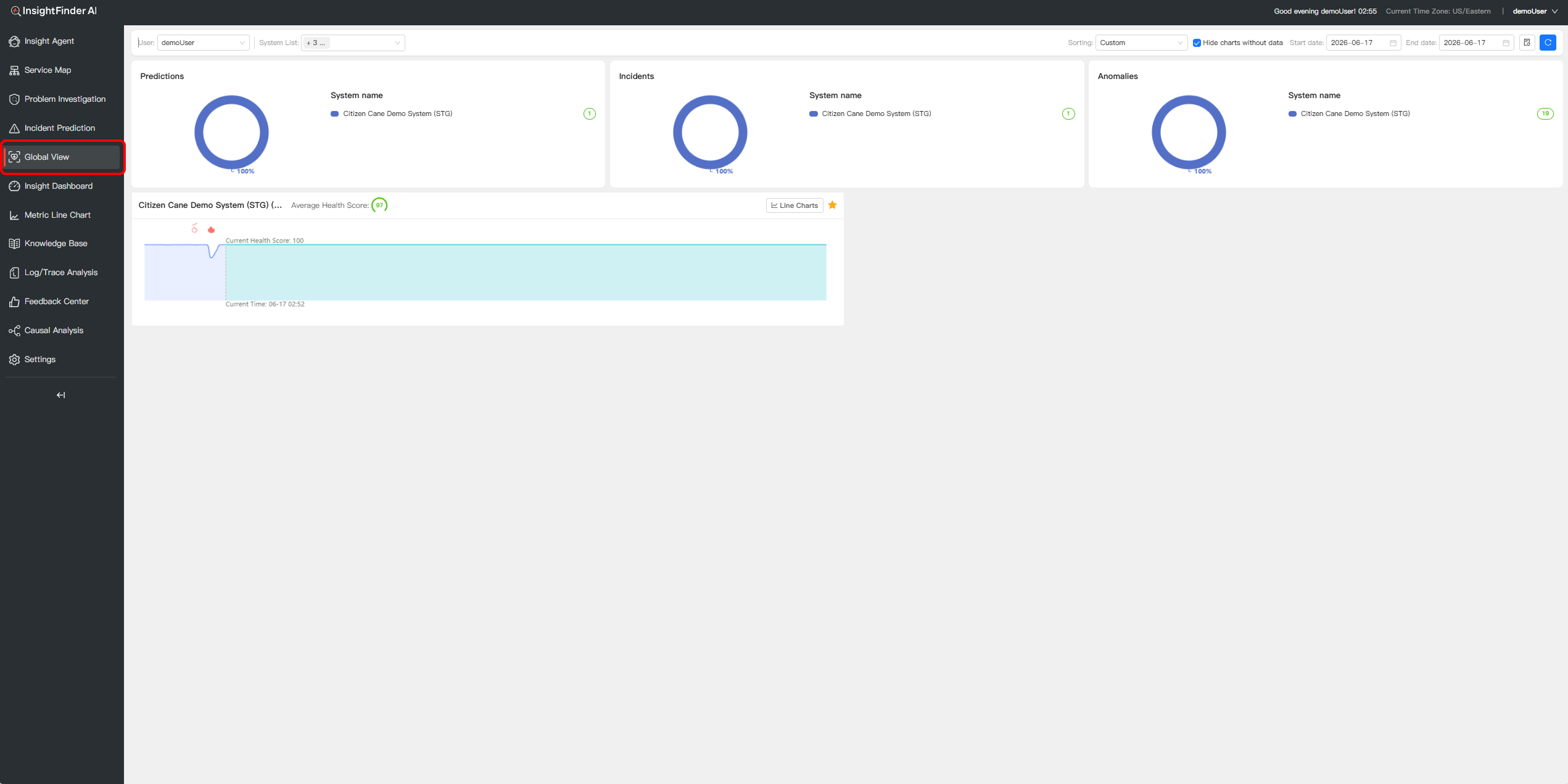
Global View
Overview
The Global View allows you to monitor, compare, and evaluate Prediction, Incidents, and Anomalies data across multiple systems in real-time within a single, centralized dashboard. This tool is designed to help operations teams quickly assess system performance, identify downward trends in health scores, and conduct proactive troubleshooting.
Key Benefits:
- Global Visibility:Centrally manage the health status of different systems, eliminating the need to frequently switch between independent panels.
- Intuitive Comparison:Horizontally compare the performance differences of various systems over the same time period.
- Precise Pinpointing:Quickly track the exact time an issue occurred using automated health scoring and chart anomaly markers.
Getting Started
Step 1: Navigation and Access
To access the Global View, follow these steps:
- Log into your InsightFinder AI platform.
- In the left navigation bar, directly click on the Global View
- You will then see the complete global monitoring interface.
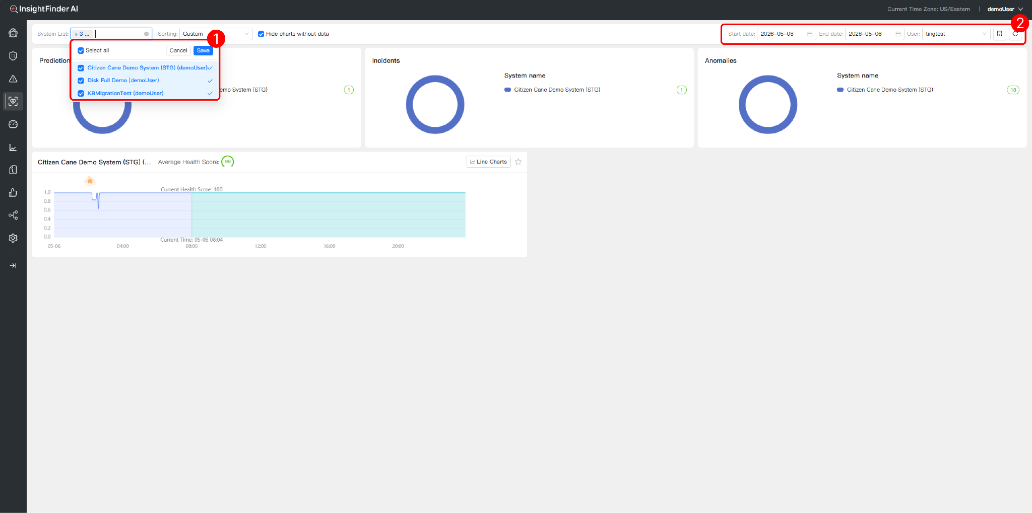
Step 2: Global Filtering and View Control
At the top of the interface, you can customize your monitoring scope using the control panel:
- System List:Use the dropdown menu to select and associate the specific systems you want to monitor
- Date & View Options:Set the Start date and End date to frame your analysis time window. Check “Hide charts without data” to filter out irrelevant items and keep the view clean.
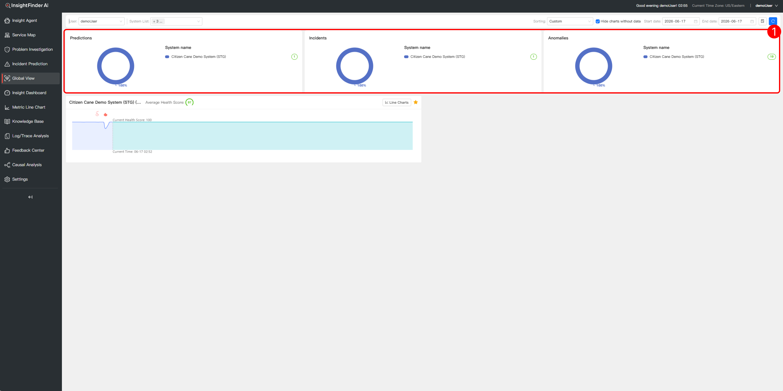
Step 3: Monitor Core Metrics
The upper part of the interface provides global summary donut charts for three key evaluation dimensions, helping you quickly grasp the macro risk landscape:
- Prediction:Displays the count of prediction alerts triggered by each system to aid in proactive intervention.
- Incidents:Summarizes and compares the total volume of recorded incidents across systems.
- Anomalies:Counts the total number of anomalies in the selected systems (e.g., the chart indicates 18 anomalies for a specific system), visually exposing high-risk areas.
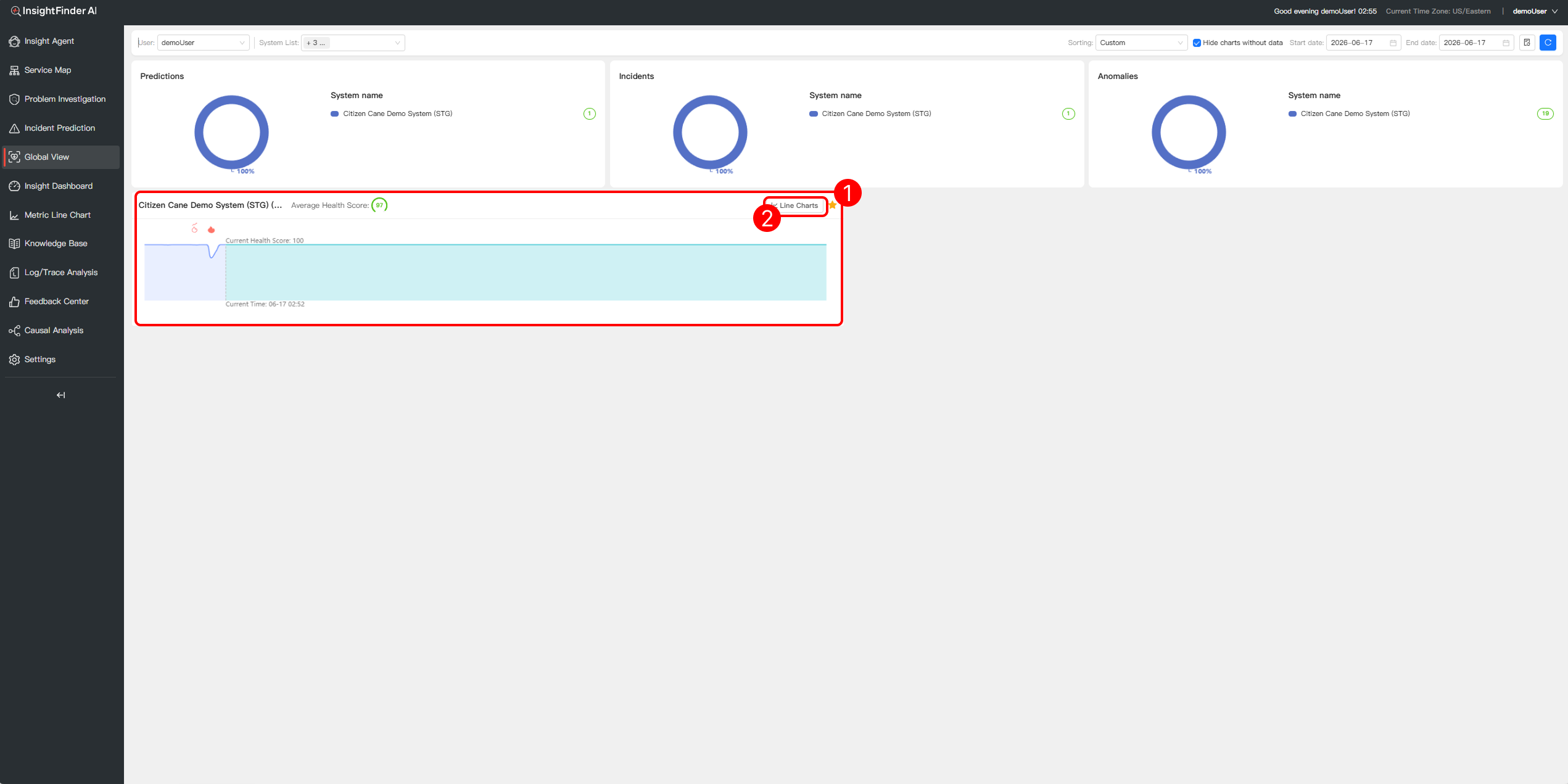
Step 4: Analyze Detailed Health Trends
The lower half of the interface provides dedicated trend analysis panels for each selected system:
- Average Health Score: The top of each panel displays the comprehensive score for that system within the selected time frame (e.g., a score of 99).
- Trend Line Charts: Shows the real-time fluctuation of the “Current Health Score”.
- Detailed View Jump: Click the Line Chartsbutton in the top-right corner of any system panel to jump to a dedicated, independent chart interface for deeper drill-down and analysis of that specific system’s metrics.
- Event and Anomaly Markers: Charts use intuitive icons (such as the flame icon) to precisely mark the exact time points when performance degradation or sudden incidents occurred..
From the Blog


See how InsightFinder helps your team deliver reliable services across every layer of the stack
Take InsightFinder AI for a no-obligation test drive. We’ll provide you with a detailed report on your outages to uncover what could have been prevented.
