Are you using Grafana to monitor IT Operations? Now you can add full stack behavior insights with InsightFinder Service Maps and Heat Maps to your Grafana dashboards.
Service Map and Heat Map Integrations for Grafana
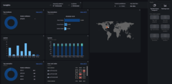
Grafana is a widely used open-source visualization platform which allows users to see charts and graphs within a single dashboard. Grafana dashboards are particularly well suited to time-series data and have been adopted widely within the IT Operations field.
InsightFinder’s Service Map and Heat Map are visualizations of full stack behavior insights automatically discovered by InsighFinder’s AI engine. The behavior insights show at-a-glance the performance and system health of all system components including physical hosts, VMs, containers, network devices, databases, and any other monitored devices within a selected IT environment, and allow immediate drill-down to see performance, anomalies, and root cause analysis for individual instances.
Service Map – built for IT Operations
The Service Map is built for IT Operations, DevOps, and SRE team members. The Service Map delivers holistic visibility into the state of host instances along with the time at which resources were consumed. The traveling time-bar at the top allows users to understand, optimize and manage all problems such as IT incidents, performance anomalies, and resource bottlenecks of IT resources.
For example, the Service Map for Kubernetes infrastructures highlights three types of data views – time series data, pod view, and components view. Time series data tells DevOps engineers when large workloads across the different hosts are in play, and helps to answer typical analysis questions like:
- Why are there so many resources consumed?
- What application components contributed to a spike on resource consumptions?
- Why did these factors contribute to the autoscaler to increase these resources?
- Were resources well-spent?
- What can be done to reduce the cost of the increase of workloads at these specific times?

The pod view shows how many containers are in use, provides guidance on when to scale up or down, and quickly identifies where the bottlenecks are in the architecture.
The components view in the timeline helps the IT Operations engineer to know where and when the incidents happened and the likelihood of cascading into other outages further down in the timeline.
The color-coded visuals easily draws attention to where incidents are on-going (red fire icons) and where incidents/problemsare predicted to happen (yellow fire icons). Users can leave notations directly on the Service Map for cross-collaboration with their peers regarding an incident and potential fixes for present and future incidents. Collaboration capabilities facilitate team approaches, and users can drill down quickly to access the full richness of the monitoring data.
Heat Map – The Executive View
The Heat Map provides a simpler display option for detected and predicted behavior insights; this view helps those in managerial and executive roles for a high-level understanding of overall system health. Business owners and managers need to understand which components are problematic and which customers are impacted so they know how to properly allocate the right resources and apply timely fixes for remediation.

The Heat Map shows instances and pods with a color-coded honeycomb display which allows drill-down for detailed analysis as needed.
To learn more about integrating full stack behavior insights with Service Map and Heat Map, visit our Grafana resources page.