Modern applications are built on hundreds of interconnected services. While this architecture drives speed and scale, it also hides complexity that can bring systems down in unexpected ways.
This post explores why service maps (dynamic views of upstream and downstream dependencies) are no longer optional, and how InsightFinder’s Dependency Graph makes that visibility actionable—so you can respond to incidents faster, optimize smarter, and manage changes more safely.
Why Service Maps Matter
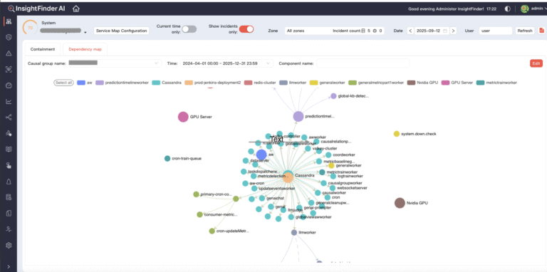
A service map provides a living visualization of how distributed services communicate, showing both upstream and downstream dependencies. Unlike static diagrams that quickly go stale, a service map should be dynamic, reflecting reality as it evolves.

Quickly understand how components connect and depend on one another with a real-time dependency graph.
This real-time visibility is critical for three reasons:
1. Complexity has grown exponentially. The shift to microservices means teams often operate hundreds of interconnected services. The Cloud Native Computing Foundation (CNCF) reports that large Kubernetes deployments can run thousands of pods at once. In environments like that, even slight latency in a single service can ripple outward across the entire system.
2.Change velocity is at an all-time high. Continuous delivery means dozens—or even hundreds—of deployments a day. Each change can introduce new communication patterns, sometimes in subtle ways that only emerge under load. A service map helps teams validate whether changes have introduced unintended dependencies.
3. Incidents rarely have obvious causes. When systems fail, the root cause often hides deep in the dependency chain. Engineers can waste valuable time chasing red herrings if they lack a dependency-aware perspective. A service map accelerates triage by showing causal relationships that help isolate the correct source of issues.
Service maps often make invisible complexity manageable. They allow engineers to understand not just what is failing, but how failures spread and where to apply fixes.
InsightFinder’s Dependency Graph: Making Service Maps Actionable
InsightFinder’s Dependency Graph shows you relationships between any distinct system components you’re monitoring. While that can apply many different way, in practice, most teams will likely use it to create service maps. The dependency graph shows the relationships between different components within a system, mapping upstream and downstream dependencies in real time.
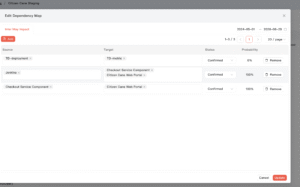
Easily review, confirm, and adjust service relationships by setting status and probability for each component link.
Here are the ways users can generate this graph:
- Automatic population through Causal Groups. When users create a Causal Group, the graph automatically populates all known relationships, provided component naming is correctly set across projects.
- Agent-uploaded relationships. Confirmed dependencies can be uploaded through the API endpoint /api/v2/updaterelationdependency, giving teams flexibility to integrate dependency data from external sources.
- Manual input. Users can also add relationships directly through the interface, ensuring accuracy when automated data is incomplete.
Once relationships are generated, the causal graph process takes over. It continuously updates the probability between two components and dynamically adjusts relationship status—marking them as “In Use” or “Not In Use” based on observed behavior. Confirmed or ignored relationships remain untouched, preserving user intent.
Dynamic status management aligns the service map with actual behavior, not just theoretical architecture. Services no longer in use automatically shift to a “Not In Use” state, reducing wasted effort during incident investigations and improving root cause analysis (RCA).
Practical Use Cases for Dependency Graphs
The Dependency Graph is a powerful tool for addressing real operational challenges. Here are three key scenarios where its value is evident:
1. Faster Incident Response When outages occur, the pressure is on to restore service quickly. Traditional monitoring dashboards can show which metrics are abnormal, but not how those abnormalities cascade across dependencies. A dependency graph highlights the blast radius immediately. If a downstream database spikes in latency, the graph shows which upstream services are impacted, helping engineers focus their efforts on the true root cause.
2. Performance Optimization Even when systems are running, hidden bottlenecks often degrade the user experience. A service may appear healthy in isolation, but its interactions can still drag down performance. For example, a microservice that waits on multiple downstream calls may inherit their delays. By visualizing these paths, teams can identify where optimizations—like caching or parallelizing requests—will deliver the biggest gains.
3. Safer Change Management Every deployment alters the system, and not always in predictable ways. By comparing dependency graphs before and after a change, teams can spot unexpected new relationships or missing ones. This is especially important in regulated industries, where undocumented dependencies can introduce compliance or security risks. Having a living service map provides a baseline for validating that systems are behaving as expected after changes.
Why Dependency Awareness Is No Longer Optional
For years, organizations relied on siloed monitoring tools and tribal knowledge to manage service dependencies. But those approaches don’t scale with the complexity and velocity of modern infrastructure. Without service maps, teams are essentially blind to the interconnected reality of their systems.
Dependency awareness is quickly becoming a baseline expectation. The organizations that adopt it aren’t just reducing mean time to resolution (MTTR)—they’re also building confidence in their ability to ship faster, scale larger, and handle failure gracefully.
Teams that succeed are those that embrace visibility. Service maps are not a silver bullet, but they are a powerful lens that reveals hidden interactions and helps engineers take action with clarity. Tools like InsightFinder’s Dependency Graph move this from concept to practice, offering a living picture of system dependencies that evolves as the system evolves.
Start Mapping What Matters
Modern infrastructures thrive on complexity, but that complexity can’t remain invisible. Service maps provide the clarity to help engineers understand system behavior beyond isolated metrics. With dozens or hundreds of interconnected services, it’s time to make service mapping central to your observability strategy.
Discover how tools like InsightFinder’s Dependency Graph can drive faster recovery, better performance, and greater confidence in every change.
Interested in learning more? Sign up for a free trial of our IT observability platform, or request demo session with our team.
